Colour Spaces Explained: RGB vs CMYK
Understanding Colour Models for Print & Digital
When it comes to design, one of the most critical considerations is colour. The way colours appear on screens versus printed materials can vary dramatically, and understanding the difference between the RGB and CMYK colour models is essential for creating visually accurate and high-quality designs. This article will explain the key differences between RGB and CMYK, and provide best practices for designing with CMYK in mind for DTF & UV printing.
What Is RGB?
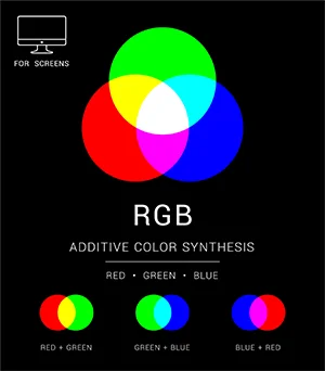
RGB stands for Red, Green, Blue. It is an additive colour model used primarily for digital displays such as monitors, TVs, cameras and mobile devices. In the RGB model, colours are created by blending varying intensities of red, green, and blue light. Each of these colours can range from 0 to 255, allowing for over 16 million possible colour combinations.
- Primary Colours: Red, Green, Blue
- How It Works: The RGB model relies on the additive process, where the combination of light in varying intensities creates different colours. When all three colours are combined at full intensity (255), the result is white light. When no colour is emitted (0), the result is black.
RGB is used for digital design because screens work by emitting light, and it’s suited for things like websites, apps, video, and digital art.
What Is CMYK?
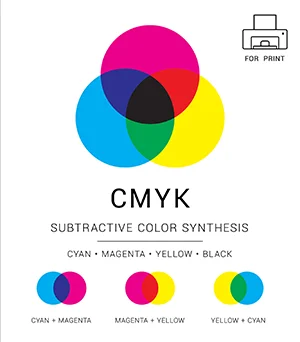
CMYK stands for Cyan, Magenta, Yellow, Key (Black). It is a subtractive colour model used for colour printing. The CMYK process starts with white (the colour of the paper) and then creates colours by adding and mixing inks. The inks reduce the light that would otherwise be reflected by the substrate, and hence this model is called subtractive because the inks subtract the amount of light reflected.
- Primary Colours: Cyan, Magenta, Yellow
In contrast to RGB, which is light-based, CMYK is pigment-based, and is ideal for print production, where ink is applied to paper. Unlike the RGB model, when all colours in the CMYK space are mixed together, they produce black (or a very dark gray), not white.
Colour Spaces Compared
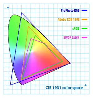
Comparing RGB and CMYK colour spaces to the CIE 1931 colour space for all visible light.
sRGB (aka "Standard Red Green Blue") is the colour space that represents colours on the web, digital screens and in file formats such as PNG. Created in 1996 by Hewlett-Packard (HP) & Microsoft to standardize colours across different devices and the internet, sRGB is the default colour space for Windows, most web browsers, and most console and PC games. It's also the standard for HDTV (high-definition television).
Swop CMYK is one particular CMYK specification which represents a typical colour range.
Notice how there are areas of CMYK that do not have an sRGB equivalent, and vice versa!
sRGB is sufficient for most uses, but other colour spaces, like Adobe RGB and ProPhoto RGB, have a wider range of colours. However, they require specialist equipment and calibration, so both these standards are only used by photograpy and other colour experts who wish to work with the largest colour gamuts possible (notice how some colours in the ProPhoto RGB space are even outside of the range for visible light!).
RGB vs. CMYK: Key Differences
- Medium: RGB is used for digital screens and light-based media. CMYK is used for physical printing on paper and other materials.
- Colour Range: RGB has a broader colour gamut (range of colours) because it uses light, which can create bright and vibrant hues. CMYK has a smaller colour gamut, meaning some colours that look great on screen may not print as well.
- Colour Creation: RGB adds light to create colour, while CMYK subtracts light to create colour.
- File Formats: Digital designs for screens are often created using RGB files (e.g., PNG, JPEG), while files for printing typically use CMYK formats (e.g., PDF, TIFF).
When compared on the CIE 1931 Colour Space (which represents all human-visible colours), one can see the differences between sRGB and CMYK.
But isn't DTF Printing actually a CMYK-W process?
Yes! DTF does not only have CMYK inks - it also prints white too. There are 2 reasons for this:
- To achieve white in your prints, even when used on dark backgrounds (eg black t-shirts)
- To create the bonding layer on the back of the transfers
Because of the bonding layer required for the transfers, it is essential for both DTF Transfers and UV Transfer Stickers to have white printed on the back of the whole design, wherever there is no transparency. With DTF Transfers, powdered glue sticks (and is cured) to the white ink during the printing process. This is the layer that allows the print to stick to fabrics during pressing. Similarly, with UV Transfer Stickers, the white attracts the glue from the rear film and it is this stickiness which allows the transfers to bond to your chosen substrate.
So does this white ink affect the colour gamut achieved with DTF printing? The answer is yes, but this depends on how the RIP software (the software used by DTF print companies to instruct the printers on how to print your designs) uses white ink during its process. How this RIP software operates, and how it is configured, determines not only how much effect the white ink will have on the achievable colour gamut during print, but also the thickness and feel of the transfers too. If done correctly, the RIP software can slightly extend the achievable colour gamut with CMYK. This is an important consideration when considering how you will work with colours at the design stage.
Best Practices when Designing for DTF Printing
When designing for DTF, it is crucial to work within the constraints of the CMYK colour model to ensure that the colours you see on-screen match what you get in print. Here are some best practices to follow:
1. Monitor Calibration
The first stage in trying to achieve the same colours with your DTF prints as you see on your screen is to actually ensure that your screen is accurate in the first place. This means that your screen needs to be correctly calibrated. For many though, this might not be straightforward, as this relies on having access to a professional-grade photospectrometer (such as the X-Rite i1 Pro range). Such equipment can be very expensive. However, only once you have a properly calibrated screen can you rely on it as your reference for the colours you want to achieve.
2. Use High-Quality Images
The quality of the images you use in your designs will make a huge difference to the final printed product. Always work with high-resolution images (at least 300 DPI) for printing to ensure clarity and sharpness. Low-resolution images will appear pixelated or blurry when printed.
3. Understand CMYK's constraints
Because RGB is based on mixing light, and CMYK is based on mixing inks, it may initially seem that CMYK cannot produce prints which are as vibrant as RGB. However, by understanding which colours are affected most by the different colour spaces, it will be easier to know how best to approach your designs. For example, certain saturated oranges, bright blues, and vibrant greens can often turn out dull when printed with CMYK if the choosen colours are outside of the CMYK gamut.
It is also important to understand how the use of White in DTF printing can also have an effect, as mentioned previously.
4. Choosing the correct colour space to work in
Many people believe that starting in CMYK mode from the beginning will prevent any colour shift when you later export the design for print. However, we do not recommend this for several reasons:
- Unless all your artwork is already in CMYK mode, the colour shift caused by certain design software (eg Adobe Photoshop) when converting images from RGB to CMYK can often be overly aggressive, and not truly representive
- Working in CMYK doesn't really factor in for how the White ink can improve the colour gamut
- Working in CMYK requires considerably more design experience than working solely in RGB
- Working in CMYK doesn't take into account some of the benefits that can be achieved from the RIP software
In short, working in CMYK mode should only be for very experienced users who fully understand the whole process, from design to DTF print, and how they can achieve the best results.
We recommend the following approach:
- Start off with your artwork in sRGB mode: This ensures that it is the closest to a typical CMYK gamut, by converting any colours which would not otherwise be reproducible in print.
- Ensure your resolution is high enough: When working with any bitmap images, ensure that the resolution is high enough to begin with, as the final result will need to be at least 300 DPI.
- Use physical swatches to determine key colours: Minimise the guesswork when choosing colours by obtaining a printed RGB colour swatch from us, so that you can see that how your chosen RGB colours will print. Alternatively, why not create your own RGB swatch that we can print for you?
- Upload your final artwork as PNG files: The PNG file format is ideal for your final artwork as it not only uses the sRGB colour space, but also stores transparency.
Conclusion
In summary, understanding the differences between RGB and CMYK color models is fundamental for any designer who designs for DTF printing. RGB is great for screens, while CMYK is necessary for printing. By following best practices and understanding the limitations of the CMYK color gamut, you can ensure that your designs look as great in print as they do on your screen.
With the right approach, you can achieve amazingly vibrant yet accurate colours with your DTF prints.
Work with professional print companies
If in doubt, or you have specific colour needs, consult with your DTF print company for the best guidelines to suit your requirements.


